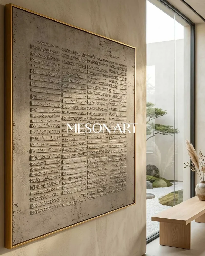
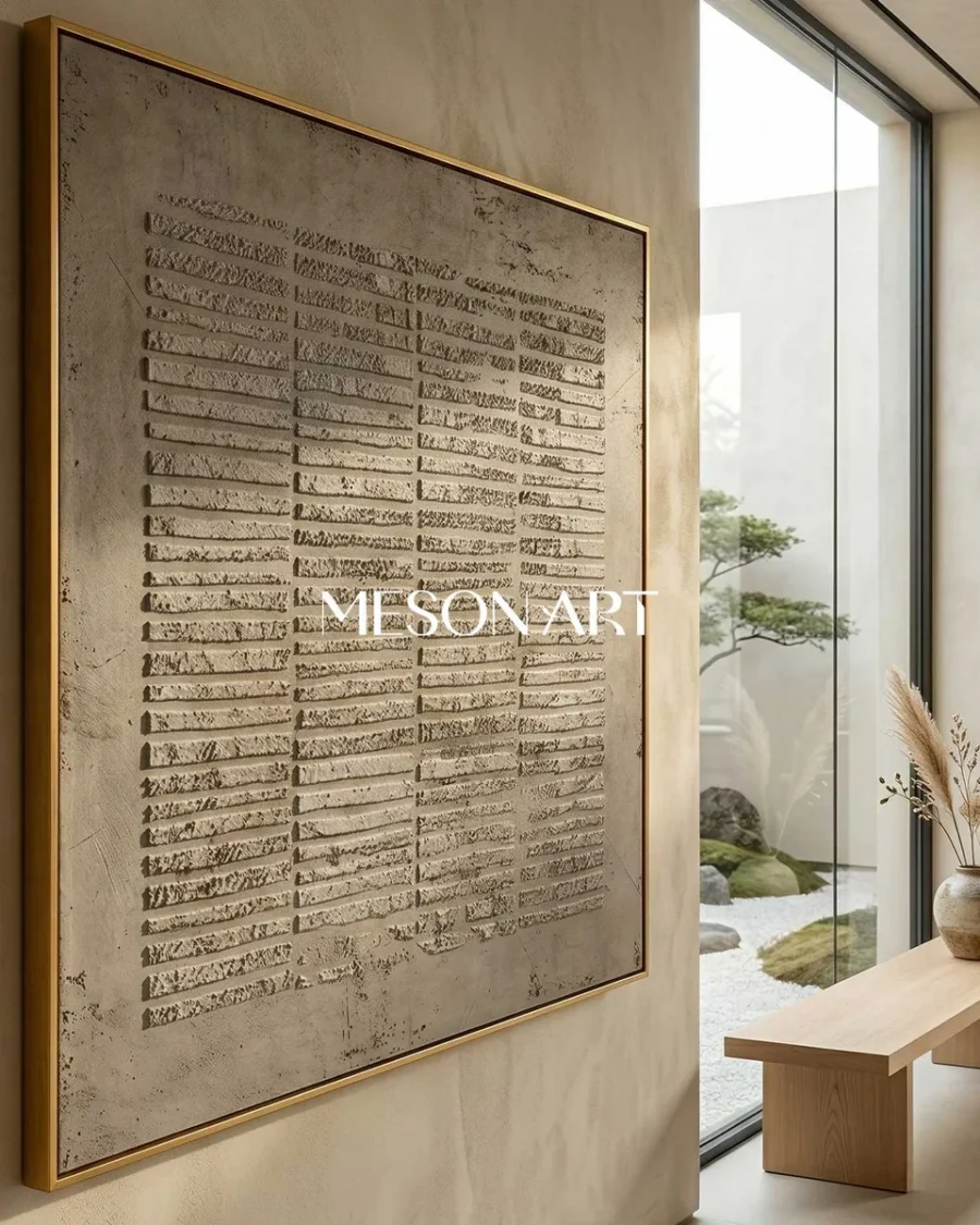
Small
Best for Compact walls, desks and narrower corridors
Typical use A quieter presence on a limited wall
Buying Guide
A practical guide to choosing artwork proportions for sofas, beds, feature walls and smaller spaces.
Quick Answer
For artwork above a sofa, a width around two-thirds to three-quarters of the sofa width often creates a balanced result.
This is a starting point, not a strict rule.
01
Measure the usable wall area rather than the entire wall. Nearby doors, windows, lamps, shelves and furniture often reduce the space that can hold artwork comfortably.
Tip Record both width and height before choosing artwork.
02
Artwork placed above a sofa, console or bed should visually relate to the furniture width rather than float independently. A width around two-thirds to three-quarters of the furniture is often a useful starting point.
Tip This is a typical proportion, not a strict rule for every room.
03
Horizontal formats often suit sofas, beds and long walls. Vertical formats typically work on narrower walls and entryways. Square compositions can feel balanced on compact walls, while panoramic works are often a starting point for very wide feature walls. Sets remain useful when a modular layout is needed.
Tip Match the artwork’s orientation to the wall’s dominant direction.
04
Large rooms often need artwork with enough visual weight so the wall does not feel empty. Smaller rooms can still use generous artwork when the composition is quiet and there is enough surrounding space.
Tip Scale is about visual weight as much as centimetres.
05
Avoid placing artwork too close to ceilings, corners or furniture edges. Spacing helps the work feel intentional rather than crowded, and it keeps the wall readable from a seated or standing view.
Tip Leave a clear margin on every side before committing to a size.
Small
Best for Compact walls, desks and narrower corridors
Typical use A quieter presence on a limited wall
Medium
Best for Bedrooms, studies and balanced living walls
Typical use A typical everyday wall presence
Large
Best for Living rooms, dining rooms and feature walls
Typical use Above sofas or consoles as a starting point
Oversized
Best for Generous rooms and long elevations
Typical use When the wall can carry more visual weight
Custom Painting
Many HTHA paintings can be adjusted to suit your wall dimensions, room proportions and preferred orientation.
FAQ
A width around two-thirds to three-quarters of the sofa is often a balanced starting point. Leave breathing space at each side rather than matching the sofa edge exactly.
A common starting point is to keep the visual centre of the artwork around seated or standing eye level for the room, then adjust for the furniture below. Avoid crowding the ceiling line.
Yes, when the composition is relatively quiet and the wall still has margin around the work. Oversized art in a small room typically needs more breathing space, not less.
It can work, but it is not a rule. Wider-than-furniture placements often feel heavier. Starting slightly narrower than the furniture usually keeps the wall calmer.
Neither is universally better. Horizontal formats typically relate to sofas, beds and long walls. Vertical formats often suit narrower walls, entries and spaces read at a closer distance.
Many HTHA paintings can be adjusted for wall width, height and orientation. Custom painting is useful when a standard size group is close but not quite right.
Measure the usable wall between furniture, doors and architectural edges. Note both width and height, then compare that area with the size group and orientation you prefer.